
EX53 Colour Balance

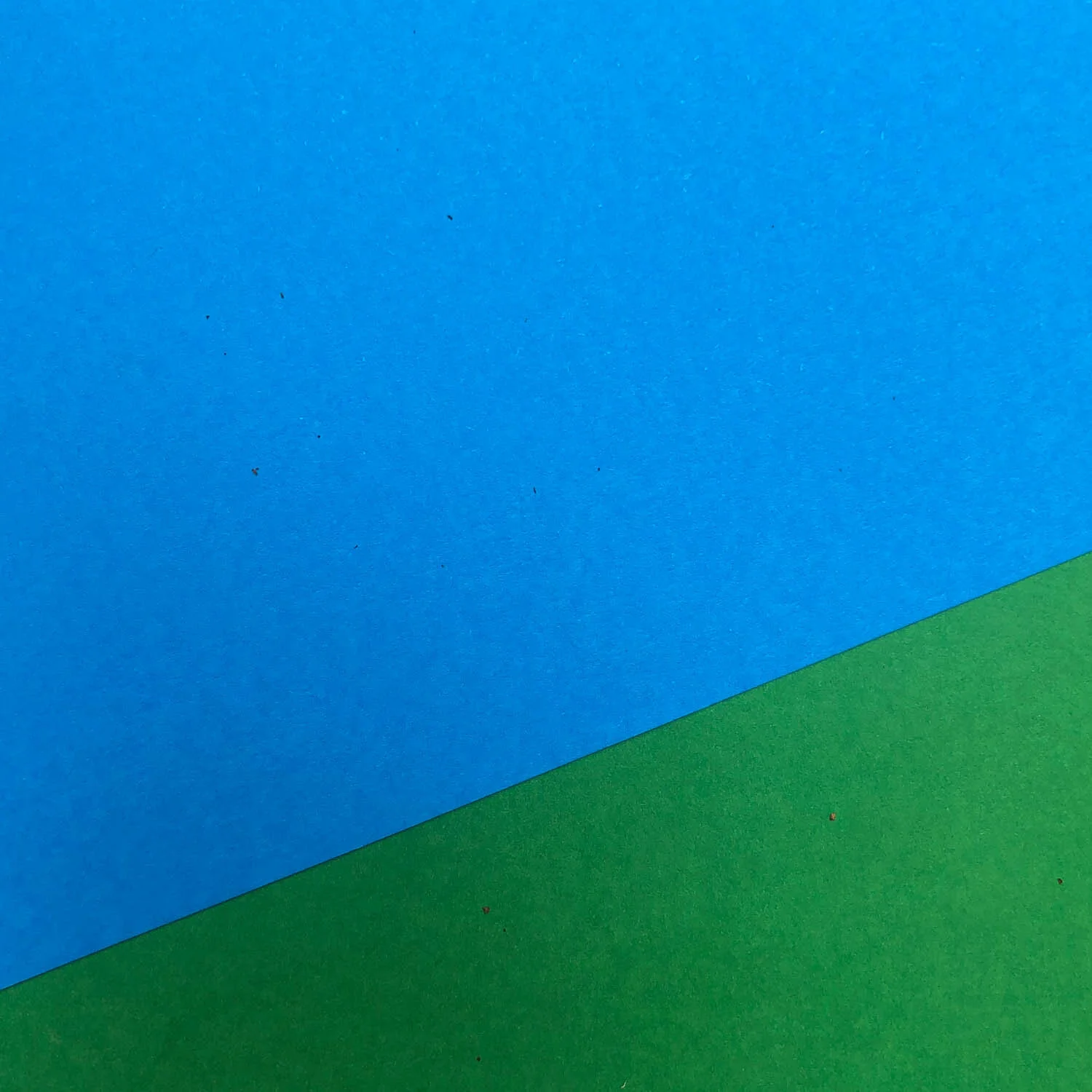
Yellow and teal. How much yellow do we have against how much of that greeny blue colour in the background? Photograph Copyright © Len Metcalf 2020
Balance is something we can’t practice enough. It is something we should study regularly. Practice regularly. Continually work on. It is something that we can always improve on, and develop our sensitivity too.
This weeks exercise centres around colour balance.
Take two different colours and find or create a simple line between them where they meet. It may be a straight line or even curved. The two colours you play with may be a coloured object on a different coloured background.
The goal is to create meaningfully balanced compositions with various amounts of each colour. If you have been doing these exercises for a long time this exercise has similarities with previous ones I have asked you to do.
The real difference this week is to totally let go of the goal of making a finished photograph, and to totally . concentrate on the balance between the two colours.
What do we mean when we say the balance between the two colours? It is primarily the relationship between the two areas in size or perceived mass balanced between the two.
Consider how much of each colour and where do you put it?
Vary the amount and size of each colour, where you place it in the frame.
Consider how each makes you feel.
Make notes of how each photograph you take feels to you.
Post five different photographs of the same colours with the same objects without any comments. Put each photograph as a seperate post.
Once a few people have posted their photographs, consider them and put one word or short phrases of how they make you feel in the comments bellow each photograph. This is so that the original poster can see what others are getting from what they are posting. Comments like ‘I find this one the most harmonious balance’ will be very helpful.
Make sure you use the threaded comments. To do this, click on the reply button under the photograph rather than start a new comment thread. This keeps the reply directly under each photograph.
At the end of the week, come back and see what others are getting from your compositions of balance between the two colours.
Do the comments match your own thoughts?
Are others getting harmonious and calm when you are? Are they getting other and different feelings to photographs that you feel are unbalanced?
To illustrate this weeks exercise, I will add my examples (taken with the phone) into the comments bellow and in the post as a slide show. This is o you can see how to place each one into a seperate post, and make the comments bellow each one. Please make sure you don’t put all your photographs in one comment as it makes it so much harder for the others to comment on each photograph.
This weeks exercise relies on our involvement, and testing the waters to see what others are thinking, feeling and reacting to our work.
Do you think we will all agree on what we consider balanced?
As a quick aside. Last months exercise of nine was amazing. The response, support, and help in the community was fantastic. Clair and I will be making the video discussing the work in the coming days, so by next weeks exercise you will be able to watch it and listen to me discussing each of the entries. I will also announce the recipients of the prints and the individual tuition.


Text and Photographs Copyright © Len Metcalf 2020